Border
Description
The border group can be found either in Toolbar (e.g. Border Picker) or Detail Panel. It groups any border related property.
Border Color
border-top-color
The color of the top border. This can be set as a color from a palette or a custom hex color.
border-right-color
The color of the right border. This can be set as a color from a palette or a custom hex color.
border-bottom-color
The color of the bottom border. This can be set as a color from a palette or a custom hex color.
border-left-color
The color of the left border. This can be set as a color from a palette or a custom hex color.
Border Style
border-top-style
The style of the top border. This can be set to:
solid dashed dotted none
border-right-style
The style of the right border. This can be set to:
solid dashed dotted none
border-bottom-style
The style of the bottom border. This can be set to:
solid dashed dotted none
border-left-style
The style of the left border. This can be set to:
solid dashed dotted none
Border Width
border-top-width
The width of the top border in px.
border-right-width
The width of the right border in px.
border-bottom-width
The width of the bottom border in px.
border-left-width
The width of the left border in px.
Border Radius
border-radius
The border radius defines radius of the corners of all the borders. This can be set in % or px.
Setting the border radius in percentage can help if you, for example, want to create a circle. In this case you could set each border radius to 50 % while setting width and height of the component to the same value.
Occurences
Toolbar
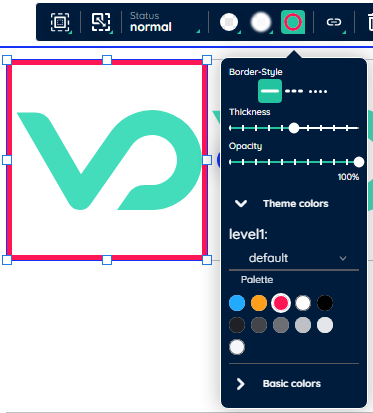
Here you can adjust common border related properties related to an state. It basically depicts a simplified version of the related picker inside Detail Panel.

Besides adjusting the common styling, choosing the color is special. A Color Picker is included in the process and allows choosing colors based on the active SubTheme or from basic colors.
Detail Panel
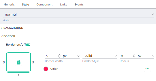
Inside the Detail Panel a picker for adjusting any border related properties can be found, which extends the possibilites of it's relative in Toolbar.

In comparison to it's relative picker inside Toolbar, this picker differs. Here, the border must be toggled to be changeable. This allows to easily turn off the border, if no border is needed.
The depiction on the left side of the picker symbolizes the component itself. By clicking on the edges, you can select and deselect the border for hiding single borders.
The big difference in this picker is that you can adjust every border individually to fit your expectations and style guide. This means, that the top border can differ from it's equivalent on the bottom. To achieve similar results, you can toggle a dialog on the right side of the picker, by clicking on the three dots.

Inside the dialog you can adjust any styling related property for every single border indivually and achieve a result of your liking. In comparison to the color picker inside the Borderbar you can also choose custom colors.